Correlation
Introduction
In most statistical packages, correlational analysis is a technique use to measure the association between two variables. A correlation coefficient (r) is a statistic used for measuring the strength of a supposed linear association between two variables. The most common correlation coefficient is the Pearson correlation coefficient. Other types of correlation coefficients are available. Generally, the correlation coefficient varies from -1 to +1.
Learning Outcomes
After studying this document you should be able to do the following:
- Conduct and interpret a correlation analysis using interval data.
- Conduct and interpret a correlation analysis using ordinal data.
- Conduct and interpret a correlation analysis using categorical data.
Scatterplot
The existence of a statistical association between two variables is most apparent in the appearance of a diagram called a scatterplot. A scatterplot is simply a cloud of points of the two variables under investigation. The diagrams below shows the scatterplots of sets of data with varying degrees of linear association.
Scatterplots of sets of data with varying degrees of linear association
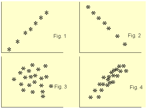
Figure 1 clearly shows a linear association between the two variables and the coefficient of correlation r is +1. For Figure 2, r is -1. In Figure 3, the two variables do not show any degree of linear association at all, r = 0. The scatterplot of Figure 4 shows some degree of association between the two variables and r is about +0.65. From the scatterplot, we can see very clearly whether there is a linear association between the two variables and guess accurately the value of the correlation coefficient. After looking a the scatterplot, we then go ahead and confirm the association by conducting a correlation analysis. However, from the correlation coefficient alone, we can not say much about the linear association between the two variables.
How to conduct and interpret a correlation analysis using interval data
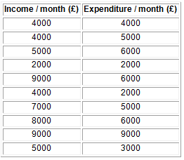
Suppose you are interested in finding whether there is an association between people monthly expenditure and income. To investigate this, you collected data from ten subjects as shown on Table 1 below.
Table 1: Set of paired data
Preparing the Data set
Start SPSS, define the variables names income and expend and use the Define Labels procedure to provide fuller names such as Income / month and Expenditure / month. Type in the data and save under a suitable name. To conduct the correlation analysis, it is advisable to produce a scatterplot of the two variables first.
To produce the scatterplot choose:
Graphs
Scatter
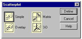
The Scatterplot selection box will be loaded to the screen as shown below, with Simple scatterplot selected by default. Click on Define to specify the axes of the plot. Enter the variables names income and expend into the y-axis and the x-axis box, respectively. Click on OK.
The Scatterplot selection box
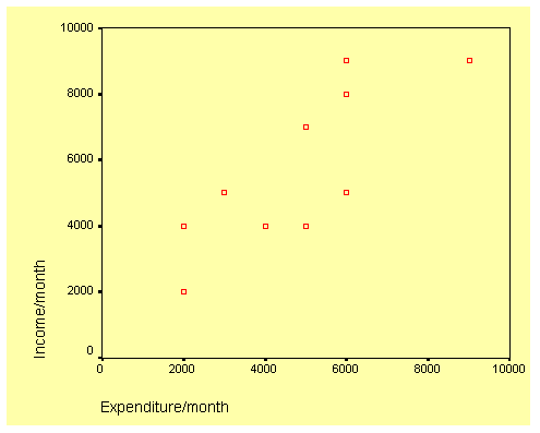
The scatterplot is shown below and it seems to indicate a linear association between the two variables.
Scatterplot Income/month against Expenditure/month
To produce the correlation analysis choose:
Analyze
Correlate
Bivariate
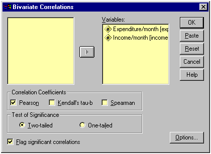
This will open the Bivariate Correlation dialog box as shown below. Transfer the two variables to the Variables text box.
The Bivariate Correlation dialog box
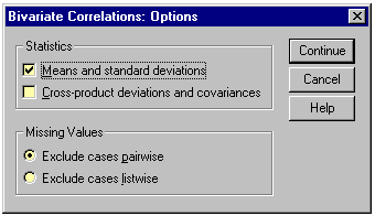
Click on Options and the Bivariate Correlation: Options dialog box will be loaded on the screen as shown below. Click on the Means and Standard Deviations check box. Click on Continue and then OK to run the procedure.
The Bivariate Correlation: Options dialog box
Let us now look at the output listing.
Output Listing of Pearson Correlation Analysis
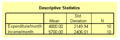
The output listing starts with the means and standard deviation of the two variables as requested under the Options dialog box. This result is shown on the table below.
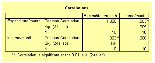
The next table from the output listing shown below gives the actual value of the correlation coefficient along with its p-value. The correlation coefficient is 0.803 and the p-value is 0.005. From these values, it can be concluded that the correlation coefficient is significant beyond the 1 per cent level. In order words, people with high monthly income are also likely to have a high monthly expenditure budget.
How to conduct and interpret a correlation analysis using ordinal data
The Pearson correlation analysis as demonstrated above is only suitable for interval data. With other types of data such as ordinal or nominal data other methods of measuring association between variables must be used. Ordinal data are either ranks or ordered category membership and nominal data are records of qualitative category membership. A brief introduction of types of data can be found under Some Common Statistical Terms which is located under Documentation found on the Content page on the left.
Suppose you are a psychology student. Twelve books dealing with the same psychological topic have just been published by 12 different authors. You and a friend were asked to rank the books in order depending on how well the authors covered the topic. The ranking is show on Table 2 below. Is there any association of the ranking by the two students?
Table 2: Ranks assigned by two students to each of twelve books

Preparing the Data set
In the Data Editor grid of SPSS, define the two variables, student1 and student2. Enter the data from Table 2 into the respective column.
To obtain the correlation coefficient follow these instructions:
Choose
Analyze
Correlate
Bivariate
This will open the Bivariate Correlation dialog box. See diagram above. Select the Kendall's tau-b and the Spearman check boxes. Notice that by default the Pearson box is selected. Click on OK to run the procedure.
Output Listing of Spearman and Kendall rank correlation
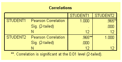
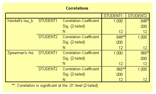
The two tables from the output listing are shown below. Notice that both the Pearson and the Spearman correlation coefficient are exactly the same 0.965 and significant beyond the 1 per cent level. The Kendall correlation coefficient is 0.848 and also significant beyond the 1 per cent level. The different between the Spearman and the Kendall coefficients is due to the fact that they have different theoretical background. You should not worry about the difference.
The association between the two ranks is significant indicating that the two students ranked the twelve books in a similar way. In fact, close examination of the data on Table 2 shows that, at most, the ranks assigned by the students differ by a single rank.
How to conduct and interpret a correlation analysis using categorical data
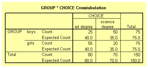
Suppose that 150 students (75 boys and 75 girls) starting at a university are asked to show their preference of study by indicating whether they prefer art or science degrees. We can hypothesised that boys should prefer science degree and girls art. There are two nominal variables here group (boys or girls); and student's choice (art or science). The null hypothesis is that there is no association between the two variables. The table below shows the student's choices.
Table 3: A contingency table
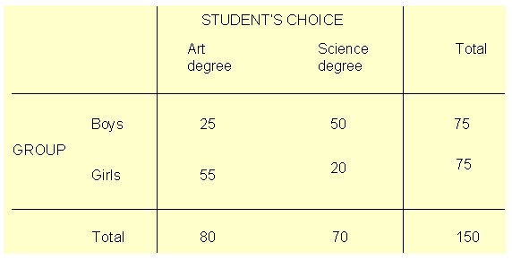
Close examination of Table 3 indicate that there is an association between the two variables. The majority of the boys chose science degree while the majority of the girls chose art degree.
Preparing the Data set
You need to define three variables here, two coding variables for group and choice. The third variable is simply the frequency count for the choice of degree. Note that no individual can fall into more than one combination of categories. Define the three variables group, choice and count. In the group variable, use the code numbers 1 and 2 to represent boys and girls respectively. Similarly, in the choice variable use the values 1 and 2 to represent art and science degrees respectively. Type the data into the three columns as shown below.
Showing coding of data in Data Editor
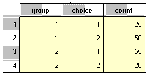
Before we can proceed, we need to tell SPSS that the data in the count column represent cell frequencies of a variable and not actual value. To do this, follow these instructions.
Choose
Data
Weight Cases
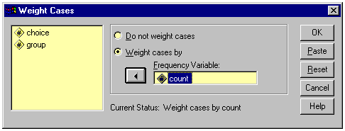
The Weight Cases dialog box will be loaded on the screen as shown below. Select the item Weight cases by. Click on the variable count and on the arrow (>) to transfer it into the Frequency Variable text box. Click on OK.
The Weight Cases dialog box
To analyse the contingency table data, choose
Analyze
Summarize
Crosstabs
The Crosstabs dialog box will be loaded on the screen as shown below. Click on the variable group and on the top arrow (>) to transfer group into the Row(s) text box. Click on variable choice and then on the middle arrow (>) to transfer choice into the Column(s) text box.
The completed Crosstabs dialog box
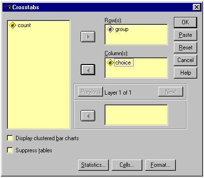
Click on Statistics to open the Crosstabs: Statistics dialog box. See diagram below. Select the Chi-square and Phi and Cramer's V check boxes. Click on Continue to return to the Crosstabs dialog box.
The completed Crosstabs: Statistics dialog box
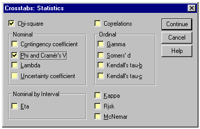
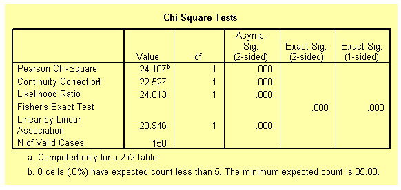
Click on Cells at the foot of the Crosstabs dialog box to open the Crosstabs: Cell Display dialog box. See diagram below. Select the Expected check box. Click on Continue and then OK to run the procedure. We have computed the cell frequencies to ensure that the prescribed minimum requirements for the valid use of chi-square have been fulfilled, i.e. a cell frequency should not be less than 5.
The Crosstabs: Cell Display dialog box
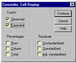
Output Listing for Cross tabulation
The first table from the output listing shown below gives a summary of variables and the number of cases.
The table below shows the observed and expected frequencies as requested in the Crosstabs: Cell Display dialog box. Notice that none of the expected frequencies is less than 5.
The table below gives the Chi-square statistics for the contingency table. It can be concluded that there is a significant association between the variables group and choice, as shown by the p-value (less than 0.01).
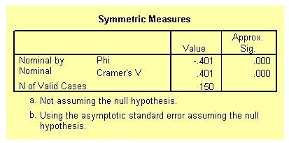
The Phi and Cramer's V coefficients (shown on the table below) of 0.401 gives the strength of the association between the two variables.
Conclusion
You should now be able to perform and interpret the results of correlational analysis using SPSS for interval, ordinal and categorical data.

