
ROC Analysis
How to Perform and Interpret Receiver Operating Characteristics (ROC) Curve
The ROC Curve procedure provides a useful way to evaluate the performance of classification schemes that categorize cases into one of two groups.
A pharmaceutical lab is trying to develop a rapid assay for detecting HIV infection. The delay in obtaining results for traditional tests reduces their effectiveness because many patients do not return to learn the results. The challenge is to develop a test that provides results in 10 to 15 minutes and is as accurate as the traditional tests. The results of the assay are eight deepening shades of red, with deeper shades indicating greater likelihood of infection. The test is fast, but is it accurate compared to traditional tests?
To help answer this question, a clinical trial was conducted on 2000 blood samples, half of which were infected with HIV and half of which were clean. Part of the data is shown below (Figure 1). The complete data is called hivassay and stored in the following path: \\campus\software\dept\spss. Use ROC Curve to determine at what shade the physician should assume that the patient is HIV-positive.
Data Structure
The data file has two variables one is the indicator variable that gives the state for each patient either HIV-positive or HIV-negative and the other is the assay assessment that ranges from 1 to 8. A small section of the data is shown below.
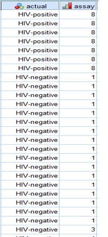
ROC Figure 1
Running the Analysis
- To run a ROC Curve analysis, from the menus choose:
Analyze > ROC Curve...
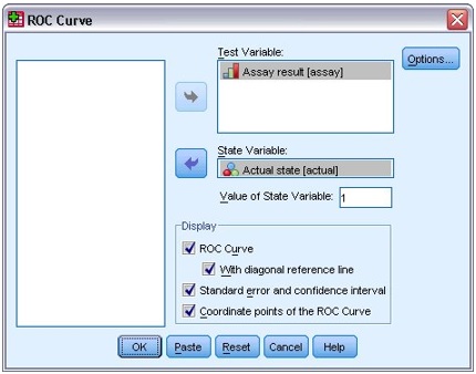
ROC Figure 2: ROC Curve dialog box
- Select Assay result as the test variable.
- Select Actual state as the state variable and type 1 as its positive value.
- Select With diagonal reference line, Standard error and confidence interval, and Coordinate points of the ROC Curve.
- Click OK. The completed dialogue box is shown on Figure 2.
ROC Curve
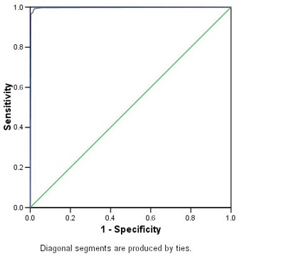
ROC Figure 3: ROC curve for Assay result
The ROC curve is a visual index of the accuracy of the assay (Figure 3). The further the curve lies above the reference line, the more accurate the test. Here, the curve is difficult to see because it lies close to the vertical axis. You can edit the curve to make it clear but will not do that here.
For a numerical summary, look at the Area Under the Curve table (Figure 4).
Area under the Curve
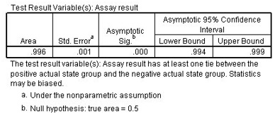
ROC Figure 4: Area under the curve for Assay result
The area under the curve represents the probability that the assay result for a randomly chosen positive case will exceed the result for a randomly chosen negative case. The asymptotic significance is less than 0.05, which means that using the assay is better than guessing.
While the area under the curve is a useful one-statistic summary of the accuracy of the assay, you need to be able to choose a specific criterion by which blood samples are classified and estimate the sensitivity and specificity of the assay under that criterion. See the coordinates of the curve to compare different cutoffs (Figure 5).
Coordinates of the Curve
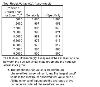
ROC Figure 5: Coordinates of the curve for Assay result
This table reports the sensitivity and 1-specificity for every possible cutoff for positive classification. The sensitivity is the proportion of HIV-positive samples with assay results greater than the cutoff. 1-specificity is the proportion of HIV-negative samples with assay results greater than the cutoff.
Cutoff 0 is equivalent to assuming that everyone is HIV-positive. Cutoff 9 is equivalent to assuming that everyone is HIV-negative. Both extremes are unsatisfactory, and the challenge is to select a cutoff that properly balances the needs of sensitivity and specificity.
For example, consider cutoff 5.5. Using this criterion, assay results of 6, 7, or 8 are classified as positive, which leads to a sensitivity of 0.978 and 1-specificity of 0.015. Thus, approximately 97.8% of all HIV-positive samples would be correctly identified as such, and 1.5% of all HIV-negative samples would be incorrectly identified as positive.
If 2.5 is used as the cutoff, 99.5% of all HIV-positive samples would be correctly identified as such, and 4.0% of all HIV-negative samples would be incorrectly identified as positive.
Your choice of cutoff will be dictated by the need to closely match the sensitivity and specificity of traditional tests. Please note that the values in this table are at best guidelines for which cutoffs you should consider. This table does not contain error estimates, so there is no guarantee of the accuracy of the sensitivity or specificity for a given cutoff in the table.
Summary
Using ROC Curve, you have analyzed the accuracy of this assay. The curve and area under the curve table reveal that using the assay is better than guessing, but you're not really interested in simply doing better than guessing. In this example, the coordinates of the curve were most helpful because they provided some guidance for determining what shade should serve as the cutoff for determining positive and negative assay results.
Using ROC Curves to Choose between Competing Classification Schemes
Usually ROC Curves are used to select competing classification schemes.
For example, a bank is interested in predicting whether or not customers will default on loans. You have proposed a model that is based on a subset of the available predictors, and you now need to show that its results are better than those from a simpler model currently in use and no worse than results from a more complex model.
Running the Analysis
- To run a ROC Curve analysis, from the menus choose:
Analyze > ROC Curve...
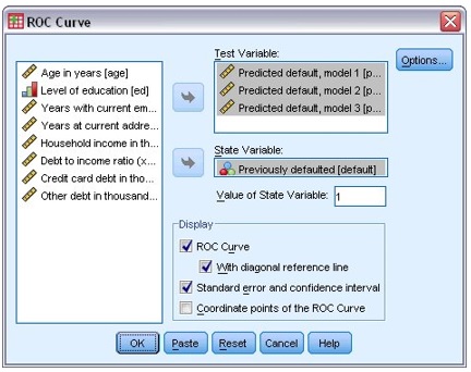
ROC Figure 6: ROC Curve dialog box
- Select Predicted default, model 1, Predicted default, model 2, and Predicted default, model 3 as test variables.
- Select Previously defaulted as the state variable and type 1 as its positive value.
- Select With diagonal reference line and Standard error and confidence interval.
- Click OK. The completed dialogue box is shown on Figure 6.
These selections produce ROC curves for how well the three models predict loan default and estimates of the areas under each curve.
ROC Curve
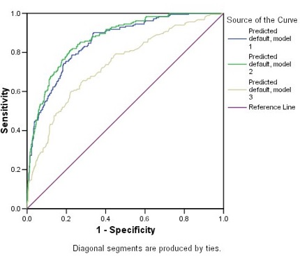
ROC Figure 7: ROC Curves for three competing models
Based on their distances from the reference line, all three models are doing better than guessing. Model 3 does not appear to be as good as the others.
Area under the Curve
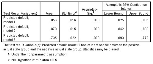
ROC Figure 8: Areas under the curve for three competing models
The asymptotic significance of each model is less than 0.05, so all are doing better than guessing. From the confidence intervals, you can see that model 3 is inferior to the other two because the entirety of its interval lies below the others. Models 1 and 2 are nearly indistinguishable, so your model is adopted because it requires less input to provide a recommendation.
Summary
Using ROC Curve, you have created multiple curves in order to compare three competing classification models. The plot of the curves offers an excellent visual comparison of the models' performances, and the area under the curve table gives you the numbers to back up your conclusions from the plot. Here, the coordinates of the curve are not as useful because the test result variables have many values, so the table would be very long and unwieldy.